Android Auto
Led UX design for an interactive prototype that helped OEMs implement responsive design guidelines across screen sizes.
UIUXPrototyping
TL;DR
Led UX design for an interactive prototype that demonstrated how Android Auto UI components adapt across different OEM screen sizes. This tool improved design and development handoff, making it easier for partners to implement guidelines in their apps.
Role
Title: Lead UX Designer
Team: Visual Designer, PM, Google designers
Contributions: Conceptualized and designed an interactive prototype showcasing responsive behaviors across screen sizes
Timeline: 2 months
Impact: Enhanced the design and dev experience for OEM app teams by giving them a hands-on resource to understand responsive behaviors and speed up implementation
Overview
Huge helps the Android Auto team at Google to translate different specifications into development ready handoff Figma files, with redlines for different screensizes and OEM manufacturers. Part of my role as Lead UX Designer for Android Auto (in the Consumer UX team at Huge) was not only improving the way Huge handed off this files to the Google team, but making sure these specs were as easy as possible to understand and implement for different OEM developers outside of the Google and Huge teams.
Problem
We were trying to address three related problems: The Android Auto team at Google needed help translating different specifications into development-ready handoff Figma files with redlines for different screen sizes and OEM manufacturers, the existing process for handing off files and components to Google was not efficient and needed improvement and the specs and documentation were not easy to understand and implement for different OEM developers outside of the Google and Huge teams.
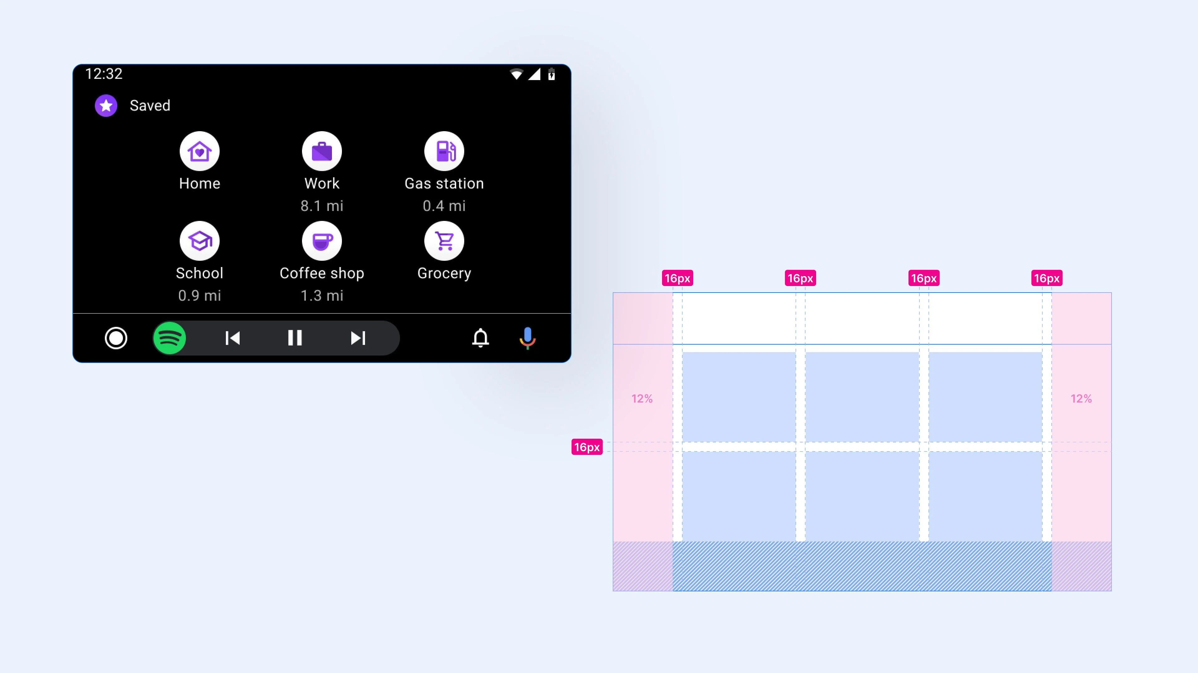
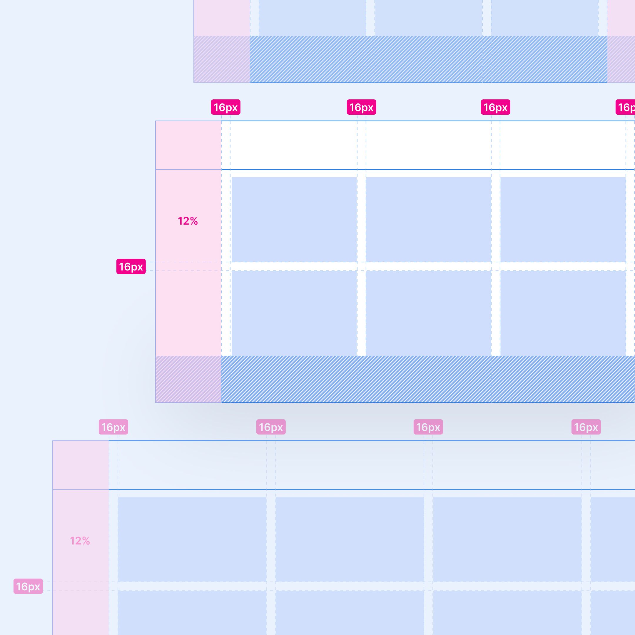
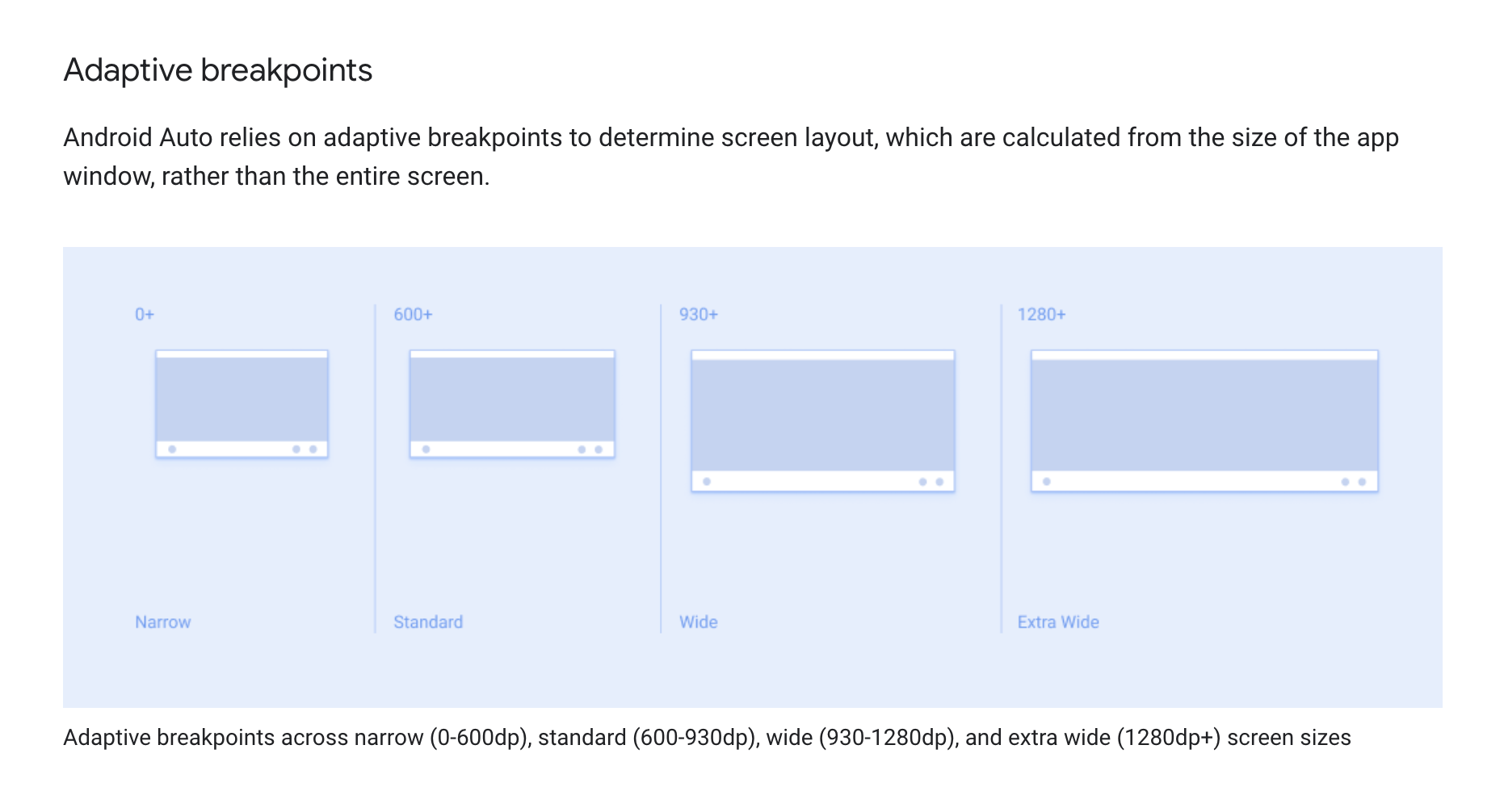 Android Auto Breakpoints
Solution
 Redlines
We improved the design and handoff process by debriefing, aligning on the scope of deliverables for each cycle, and proposing new ideas for delivering spec files and components back to Google to make it easier to read, navigate, and implement for OEM developers.
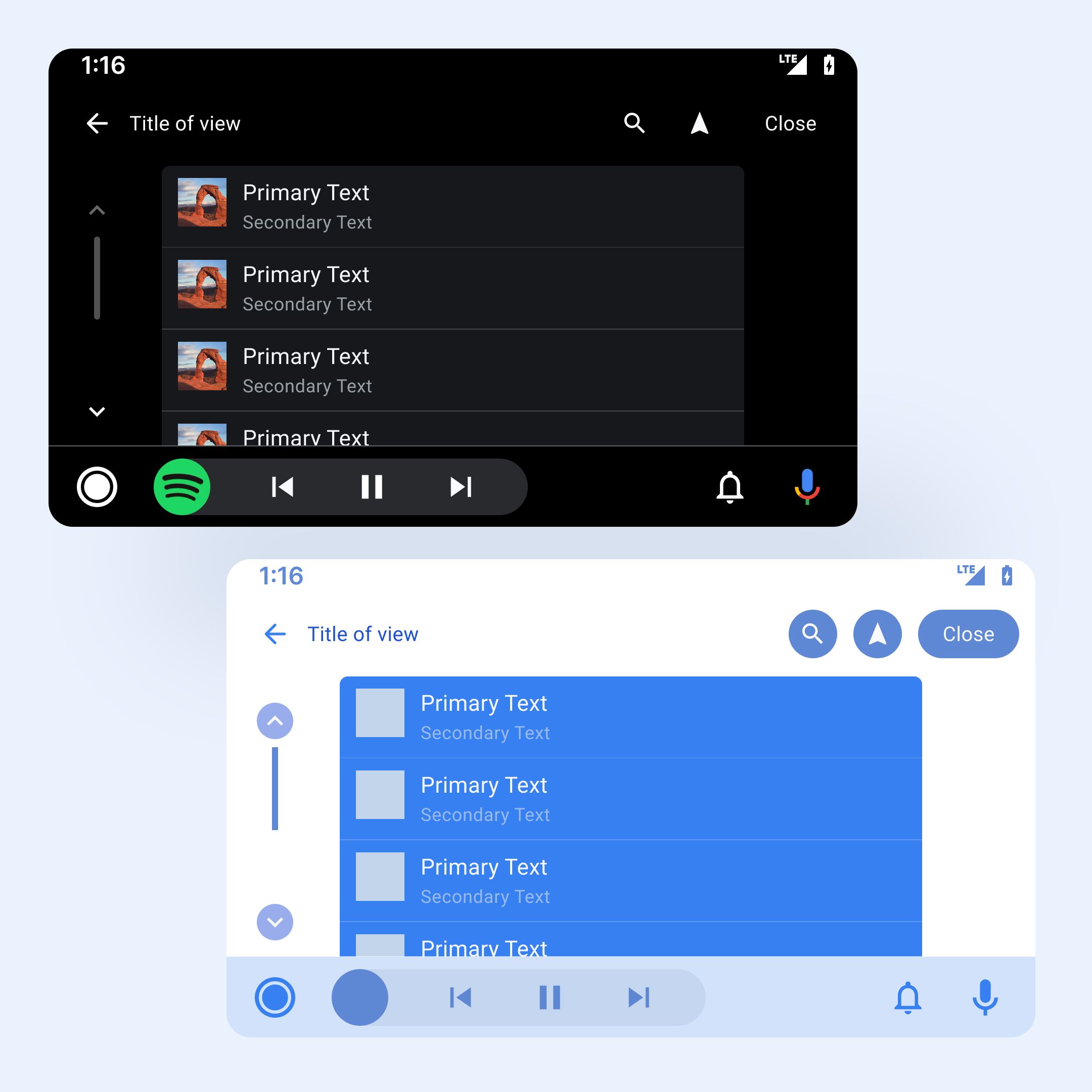 List template
The Figma Design System library was updated and expanded with new variants that supported the new requirements for the List and Grid templates with breakpoints for four different widths and three heights and with wireframes and dark and light themes support.
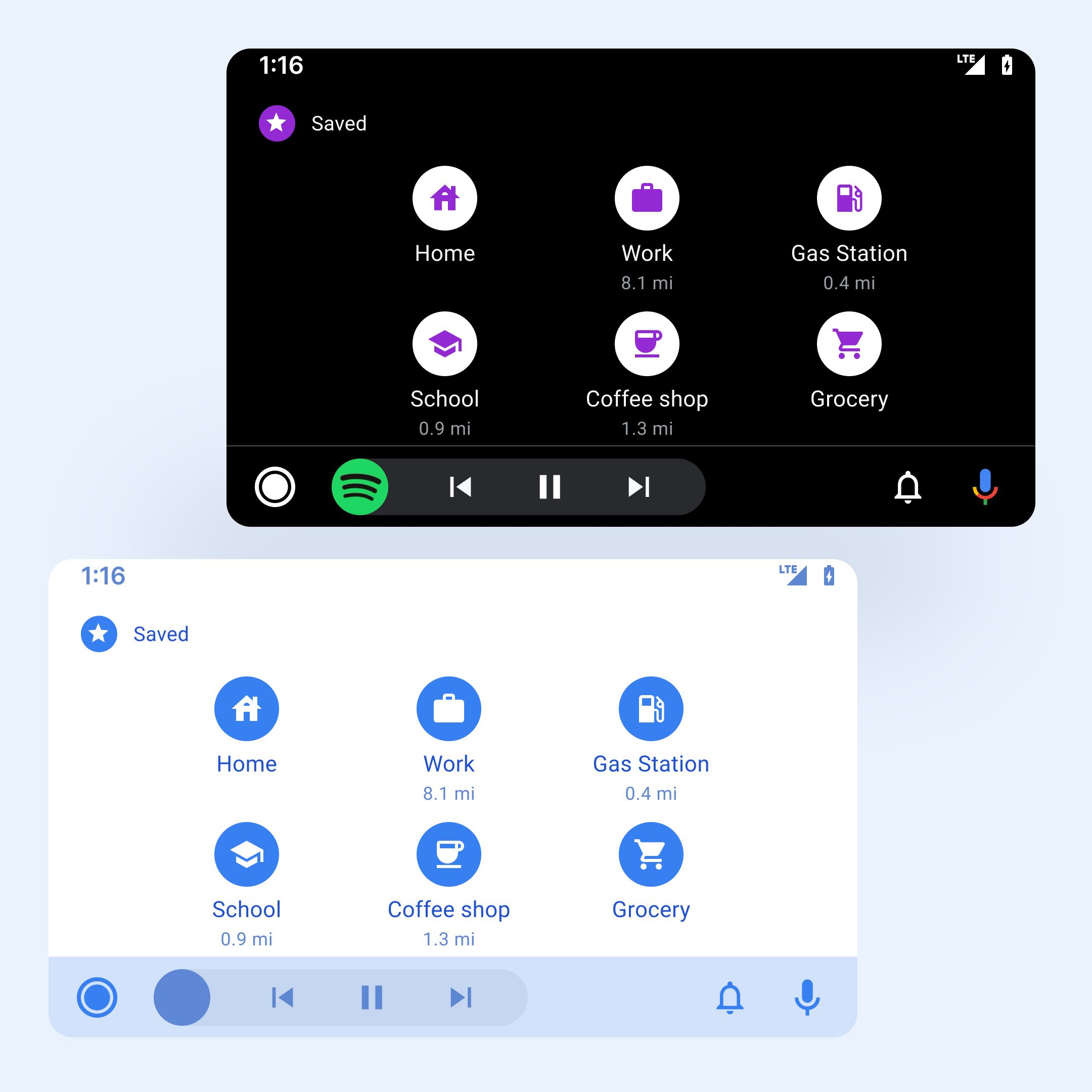 Grid template
An interactive Figma prototype was proposed and delivered to make it easier for OEM developers to review and implement the new specs and documentation.
Impact
- The Android Auto team at Google received development-ready handoff Figma files with redlines for different screen sizes and OEM manufacturers.
- The improved design and handoff process made it easier to read, navigate, and implement the specs and documentation for OEM developers outside of the Google and Huge teams.
- The updated and expanded Figma Design System library provided better support for breakpoints and themes.
- The interactive Figma prototype made it easier for OEM developers to review and implement the new specs and documentation.